Branding
We designed a logo for Peter that incorporated the patterns of some of his nailwork. To ensure that the design of the pattern was recognizable, we used a simple, sans-serif font accompanied by understated nail graphics.

Branding
We designed a logo for Peter that incorporated the patterns of some of his nailwork. To ensure that the design of the pattern was recognizable, we used a simple, sans-serif font accompanied by understated nail graphics.
Concept Work
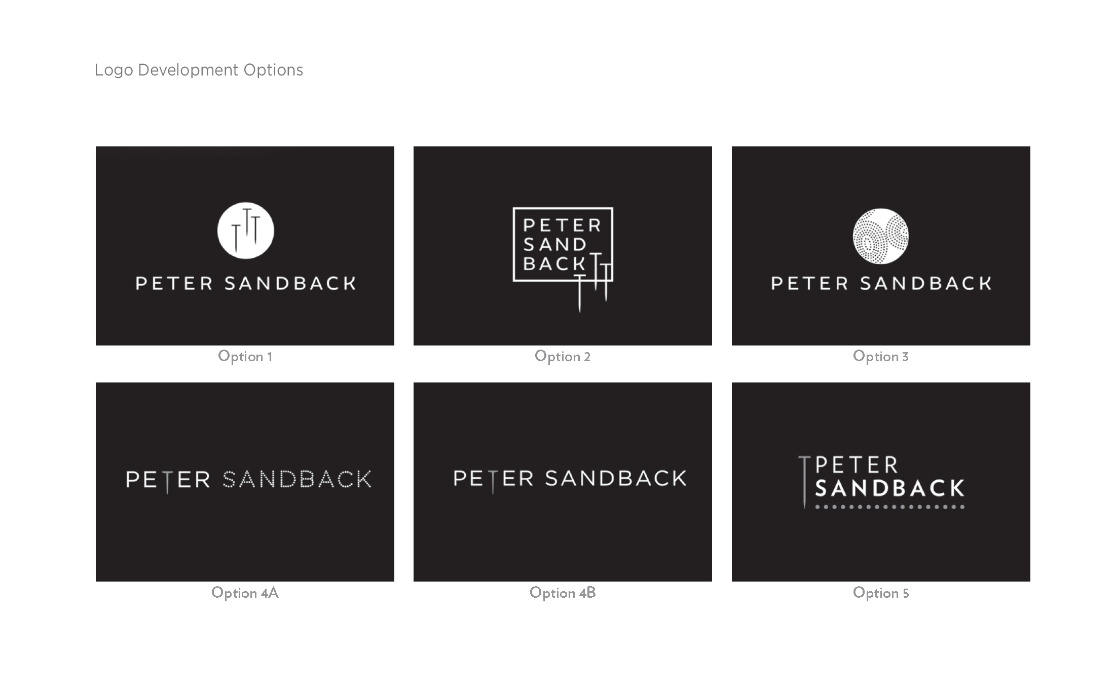
While developing Peter’s logo, we conceptualized several different ways to highlight Peter’s unique brand, including graphic nails and dotted patterns that emulated his craft. Each design created still retained a level of simplicity so that the craftwork could stand on its own.

Concept Work
While developing Peter’s logo, we conceptualized several different ways to highlight Peter’s unique brand, including graphic nails and dotted patterns that emulated his craft. Each design created still retained a level of simplicity so that the craftwork could stand on its own.

